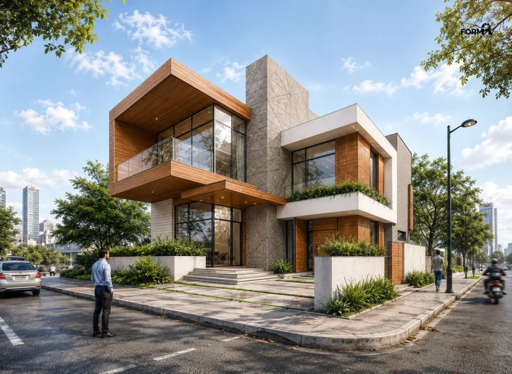
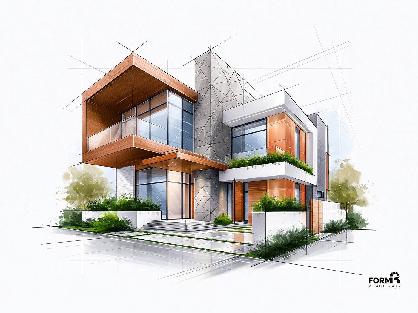
This article traces a modern residential villa from concept sketch to photorealistic 3D visualization, examining the design decisions that survived the translation intact: a cantilevered timber volume for shade and street presence, a faceted stone wall anchoring the corner, and a layered material palette built for a dual-frontage urban site. It covers the design philosophy behind the corner-lot response, the passive sustainability logic embedded in the massing, and what FORM3's sketch-to-render workflow reveals about how AI-assisted visualization is changing without replacing the architect's hand.
Introduction
Every building lives twice before it's built once. First as an idea loose enough to hold contradictions—cantilever and mass, warmth and geometry, privacy and openness. Then as a render precise enough to survive a client meeting, a planning submission, a contractor's first walk-through.
The distance between those two states is where most design decisions actually get made, and it's rarely visible in the finished project. This villa—a two-story residence on a street corner, with a cantilevered timber volume reaching toward the intersection—is a useful case study in that translation, because both stages survive: the sketch and the render, side by side.
Project Overview
The site sits at a street corner with two public frontages, flanked by mature trees and a visible city skyline beyond. That corner condition set the brief before a single material was chosen: the building needed a strong, legible presence from two directions at once, without reading as two competing facades bolted together.
The resulting form resolves that with one dominant gesture—a cantilevered upper volume, clad in warm horizontal timber, that projects toward the street corner and shelters the entry sequence below.
A vertical stone panel, cut in an angular, faceted pattern, anchors the composition where the two frontages meet, acting less like a wall and more like a hinge the rest of the building rotates around.
Design Philosophy
The governing idea here isn't ornament—it's orientation. Every material and every projecting volume answers a question about how the building meets its site: where does it need to shade itself, where does it need to open up, where does it need to stand back from the sidewalk.
The cantilever isn't a stylistic flourish. It's a covered threshold, a shading device, and a street-level gesture all in one move.
That's consistent with a design standard worth naming directly: resolve the building structurally, spatially, and emotionally before a single decorative decision gets made. The warmth of the timber and the texture of the stone come after the massing works—not instead of it.
Problem Identification
Corner sites are deceptively difficult. Two street frontages mean two audiences, two solar exposures, and no single "back of house" to hide the practical stuff.
Left unresolved, that condition produces the generic outcome seen on so many urban corners: a symmetrical box with matching windows on both sides, privacy sacrificed for a tidy elevation.
The other pressure was scale. A two-story residential volume on an open corner can easily read as either too domestic for its urban context or too heavy for its street. Getting the proportion right—present without overwhelming—was the real design problem underneath the material choices.
Design Solution
The cantilever solves the corner problem directly. By projecting the upper timber volume toward the intersection and letting it float above a fully glazed lower corner, the design creates a covered outdoor room at street level—inhabited, shaded, and visually active instead of a blank corner elevation.
Glass balustrades on the upper terrace keep the timber mass from reading as solid weight; the eye moves through the balcony, not around it.
The faceted stone wall does the quieter work. Positioned at the pivot between the two frontages, its angular, hand-finished texture gives the building a fixed point of visual weight, so the cantilever reads as intentional projection rather than an unanchored overhang.
Below, a sequence of stepped stone terraces and layered planting softens the transition from public sidewalk to private entry—privacy negotiated through landscape, not fencing.
Materials
Three materials carry the entire palette, deliberately restrained: warm horizontal timber cladding on the cantilevered volume and select wall planes, a light textured stone with a faceted, tessellated surface pattern on the anchor wall, and smooth white render across the remaining envelope.
Full-height glazing runs beneath the cantilever, framed in dark metal sections that read as fine lines against the timber and stone. Concrete paving with grass-jointed seams carries the material language into the landscape.
The stone wall isn't decoration. It's the one fixed point the rest of the building is designed to rotate around.
Construction Techniques
A cantilevered upper volume of this depth is a structural commitment, not a rendering trick—it demands a resolved transfer structure below, concealed within the ground-floor wall and column arrangement, and careful coordination between the timber cladding system and its supporting frame so the overhang reads as effortless rather than propped.
The faceted stone panel is most efficiently achieved as a prefabricated textured cladding system, allowing the geometric pattern to be produced with construction-grade precision rather than hand-cut on site.
Sustainability
The cantilever's deepest value isn't visual—it's thermal. A projecting upper volume shades the fully glazed ground floor through the highest-angle sun of the day, cutting solar heat gain before it becomes a mechanical cooling problem.
Deep balcony overhangs repeat that logic on the upper level. Planting at both the ground-floor buffer and the upper terrace edge adds a second layer of passive cooling and softens the building's thermal mass against the paved street environment.
None of this required a sustainability checklist bolted on afterward—it's what a well-oriented cantilever does by default.
User Experience
From the street, the building offers a covered, shaded arrival sequence rather than an exposed front door—the kind of small comfort that changes how a home feels to approach on a hot afternoon or in rain.
Inside, the logic reverses: full-height glazing under the cantilever pulls the shaded street view and the tree canopy into the ground-floor living space, while the upper terrace, wrapped in glass rather than solid rail, keeps the corner's city-skyline view available from the private level too.
Innovation
The more interesting story here is process, not just product. The concept sketch and the final visualization are separated by an AI-assisted rendering workflow that let the design team test massing, material, and light at a level of realism that used to require full modeling and a lighting pass measured in hours.
That speed doesn't replace design judgment—every material decision visible in the final render was made in the sketch, not invented by the render engine.
What changes is how quickly a design idea can be tested against real light, real context, and a real street, which means more design iterations survive to the version a client actually sees.
Technical Insights
Getting a faceted stone pattern to read correctly at both close range and street distance required resolving panel joint lines as part of the pattern geometry, not as a construction afterthought—a detail that has to be settled at design stage, well before fabrication drawings.
Similarly, the glass balustrade needed a base detail concealed enough that the cantilevered timber volume still reads as a single floating plane from the street, rather than a mass interrupted by a visible rail line.
Architectural Challenges
The hardest balance was making the cantilever feel inevitable rather than showy. A projection this bold can easily tip into spectacle—the building becomes about the trick rather than the site.
Keeping the material palette restrained to three elements, and letting the stone wall carry the visual weight the cantilever might otherwise claim alone, kept the composition disciplined instead of performative.
Lessons Learned
The clearest lesson from this project: the sketch stage isn't a rough draft of the final design—it's where the real decisions get locked in.
Every major move in the finished render—the cantilever's shading function, the stone wall's anchoring role, the transparency at ground level—was already present, if loosely, in the first concept sketch.
The rendering stage tested and confirmed those instincts against real light and material; it didn't originate them.
Future Opportunities
The same sketch-to-render pipeline scales well beyond a single villa. Corner-lot infill sites, mixed-use ground floors, and multi-unit residential developments all share the same dual-frontage design problem this project solved.
There's also a clear next step in material research: testing whether the faceted stone pattern can be produced regionally at the same construction tolerance shown here, which would make the detail more accessible across markets with different fabrication capacity.
Conclusion
The distance between a watercolor sketch and a photorealistic render isn't really about image quality. It's about how much design conviction survives the trip.
In this villa, the cantilever that sheltered the entry in the first sketch is the same cantilever cooling the glazing in the final render. That continuity—not the rendering technology—is the actual measure of a design process working as it should.
Key Takeaways
- A cantilevered upper volume can solve shading, privacy, and street presence in a single structural move—not three separate design problems.
- Corner sites demand a building that performs for two frontages at once; a single anchoring element, here a faceted stone wall, keeps that dual reading unified.
- Passive solar shading via massing costs nothing to operate and should be resolved before any mechanical cooling strategy is considered.
- AI-assisted visualization speeds up how fast a design idea can be tested against real light and context—it doesn't replace the design judgment made at sketch stage.
- The best test of a design process is how much of the original sketch's intent survives, unchanged, into the final built or rendered form.