Introduction
Every house I design has to answer one question before a single wall goes up: what is the one idea this building cannot survive without?
For this residence, the answer was the roof. Not as a covering, but as the organizing gesture for the entire composition—the single fold of plane that decides where light enters, where the car shelters, where the family gathers, and where the building meets the street.
This article walks through that idea from concept to completion: the thinking behind the design, the architectural language that makes it recognizable, and the lessons it offers anyone building, renovating, or simply drawn to modern residential architecture.
Executive Summary
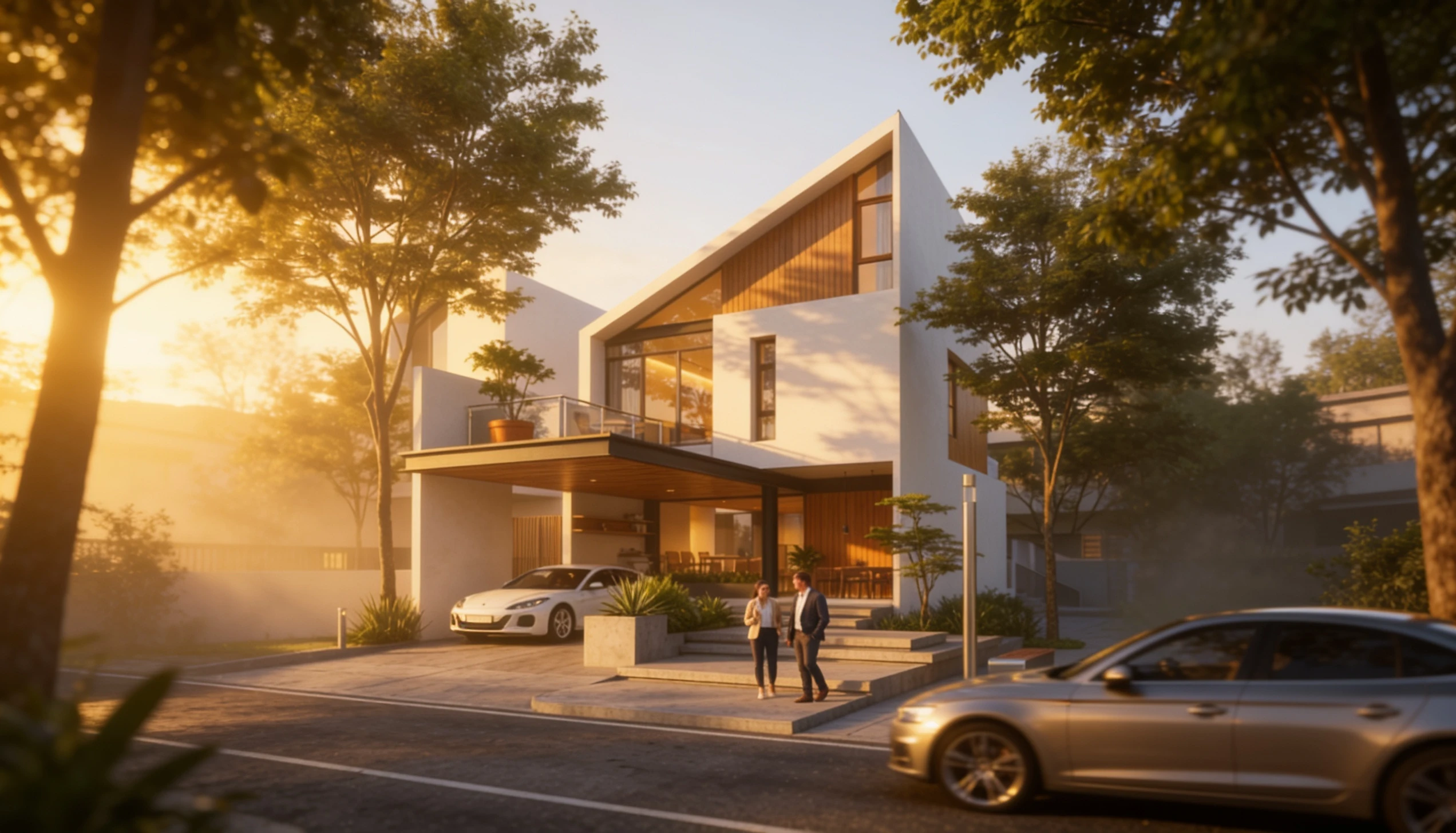
The Folded Roofline House is a two-story contemporary residence built around one continuous, asymmetrically pitched roofline that extends from the upper bedroom level down into a sheltered carport and entry sequence.
The design prioritizes three things simultaneously: a strong street-facing identity, a seamless indoor-outdoor transition at ground level, and a material palette—white render, dark steel, natural timber—restrained enough to let the geometry do the talking.
- Core Design Principle: Reduce the building to one dominant architectural move and let every other decision support it.
- Signature Element: The slanted roof plane that doubles as both upper-level enclosure and ground-floor carport canopy.
- Landscape Integration: A walled garden, layered planting, and a stepped concrete approach that soften the building's geometry.
- Material Strategy: Warm timber soffits and accents against a white monolithic shell, anchored by black steel framing.
Design Philosophy: One Roofline, One Idea
Architecture gets weaker the more ideas it tries to hold at once. The strongest residential designs I've worked on tend to share a single trait: a dominant gesture that the rest of the building is built to support, rather than compete with.
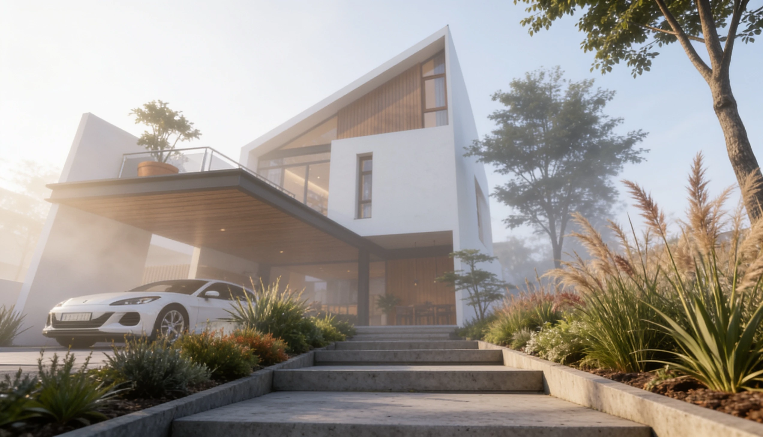
Here, that gesture is the roof—a single folded plane that begins as a steep, dark-clad gable at the upper level and unfolds downward into a flat timber-lined canopy sheltering the carport and entry below.
It's the same architectural surface doing two completely different jobs: enclosing private space above, and creating a generous, shaded threshold below.
That continuity is what gives the elevation its identity. You don't need a signature material or an ornamental detail to make a house memorable—you need one decision, carried through with discipline.
Massing and Form: Asymmetry as a Design Tool
The building massing reads as two interlocking volumes rather than a single box. A tall, narrow gable-fronted form anchors the composition vertically, while a lower, more horizontal volume capped by the extended carport roof grounds it at street level.
This asymmetry does real work: it breaks the visual weight of a two-story facade, creates a covered outdoor room without adding enclosed square footage, and gives the house a distinct silhouette from the street that doesn't rely on color or ornament.
The upper gable is clad in dark, almost black paneling against the lighter render below—a deliberate contrast that makes the roofline read as sculpture rather than just structure.
From the street, the eye is drawn up the slope of the roof before it ever settles on a window or a door, which is exactly the sequence a strong facade should create.
Material Palette: Restraint as a Strategy
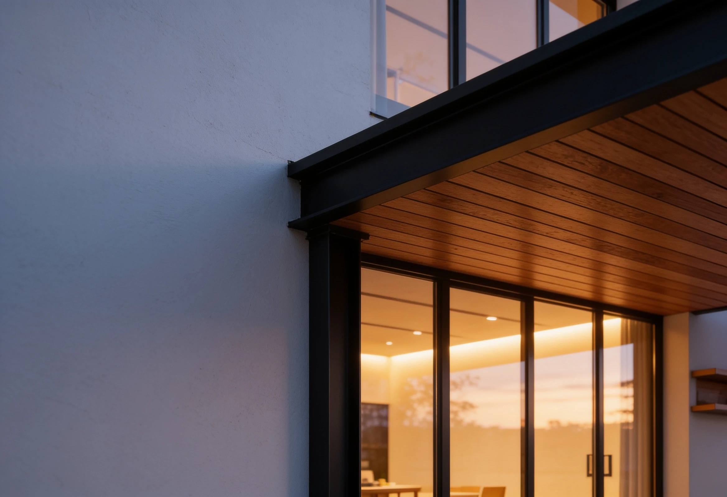
Three materials carry the entire exterior: white painted render, blackened steel and panel detailing, and natural timber.
That's it. No fourth material competes for attention, which is precisely why the design photographs and reads as cohesive from every angle.
White Render: Provides the neutral backdrop and the largest surface area, keeping the form legible from a distance.
Black Steel and Panel Cladding: Frames the glazing, defines the carport structure, and anchors the dark upper gable—the material doing the most visual work in the smallest quantity.
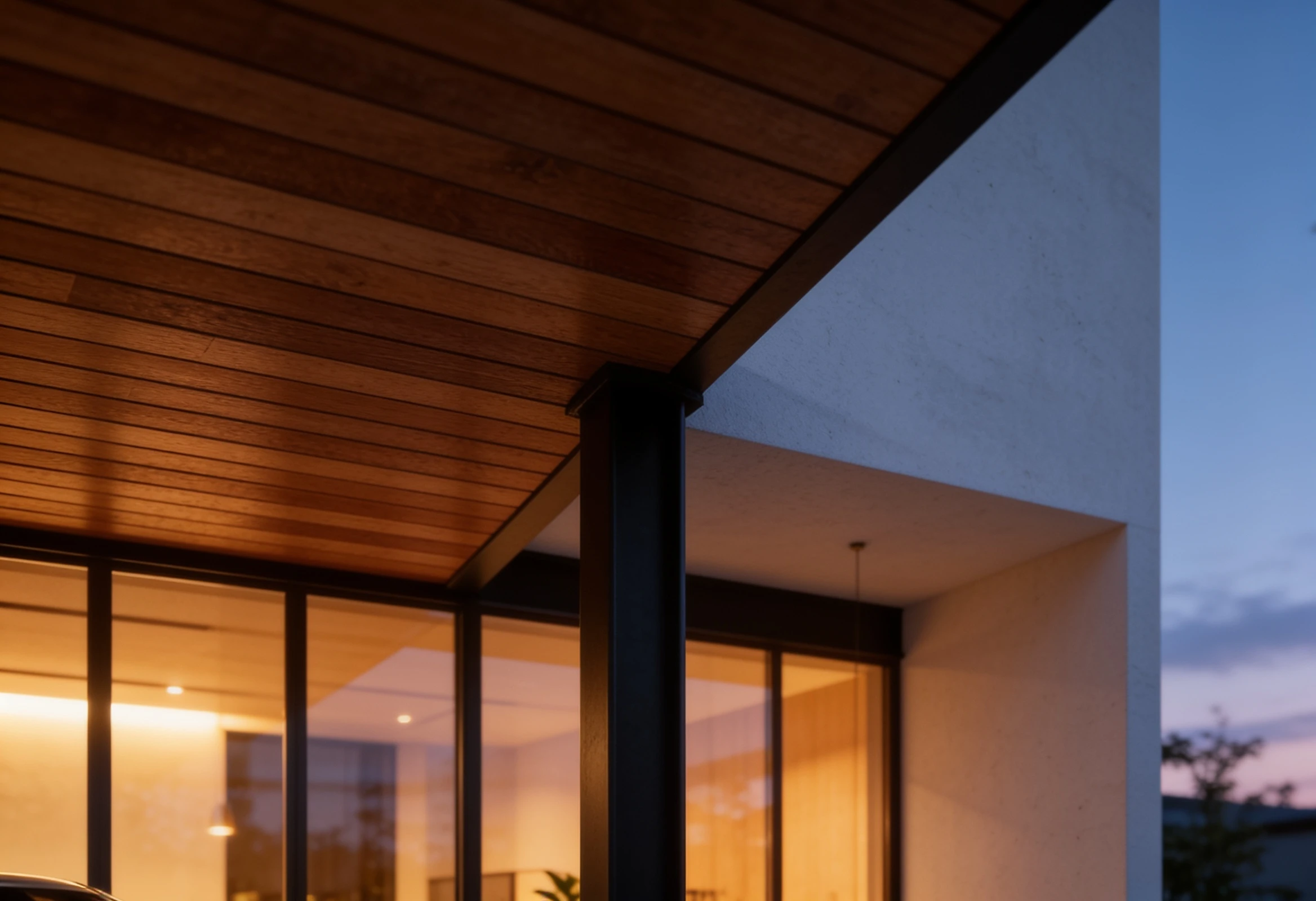
Natural Timber Accents: Warms every space it touches—the carport ceiling, the entry soffit, and select interior-facing walls—preventing the white-and-black palette from feeling cold or corporate.
This is a useful principle beyond this specific project: a limited material palette, applied with intention, almost always outperforms a varied one applied cautiously.
Indoor-Outdoor Transition: The Carport as Threshold
One of the most functionally important moves in this design is also the most easily overlooked: the carport isn't treated as a separate utility structure bolted onto the house.
It's an extension of the roofline itself, which means the journey from car to door to living space happens entirely under one continuous plane.
That continuity changes how the threshold feels. Arriving home means moving through a shaded, timber-lined space that's already part of the house's architectural language—not crossing from an exposed driveway into a separate front door.
Combined with full-height glazing along the ground-floor living and dining area, the boundary between sheltered outdoor and enclosed indoor space becomes deliberately soft.
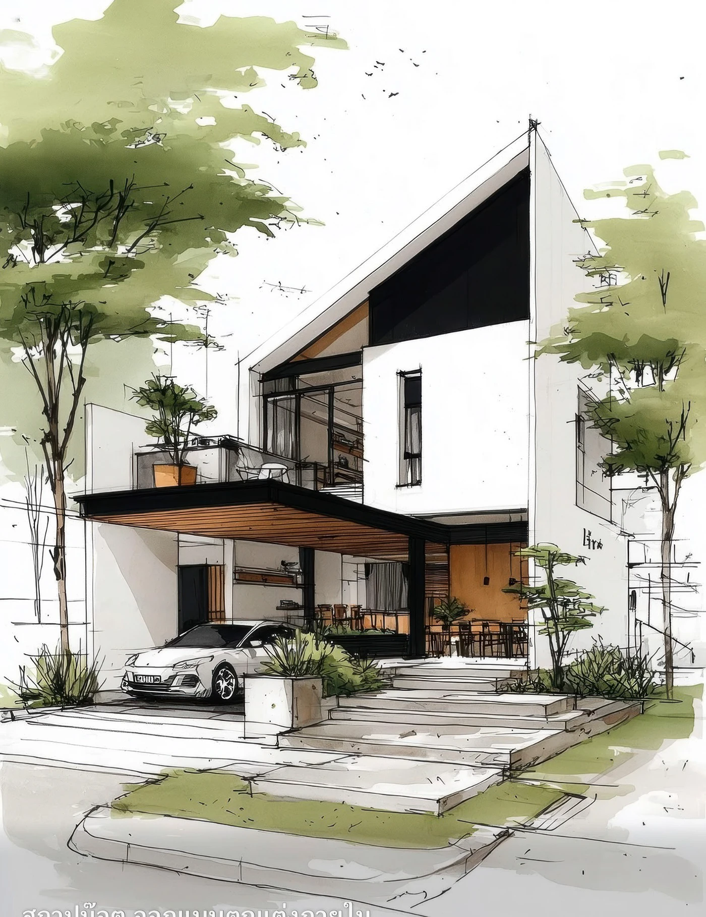
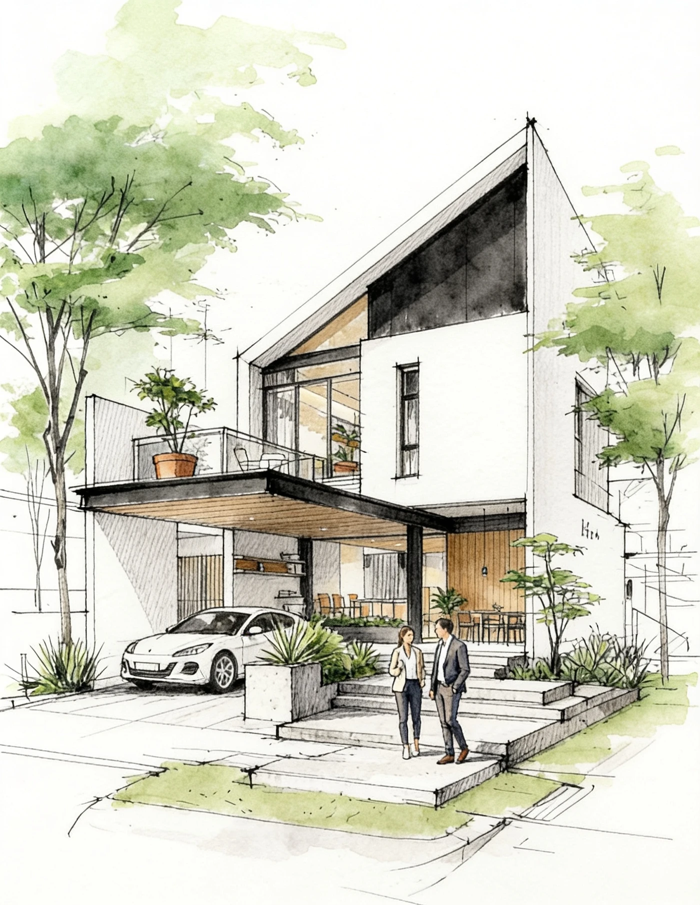
Early Concept Sketch: The same folded roofline, carport canopy, and material logic were already established before the final visualization stage.
From Concept Sketch to Built Form
What's notable when you compare the early concept sketch to the finished elevation is how little changed.
The hand-rendered study already established the dark gable, the timber carport ceiling, the layered front garden, and the proportion between upper mass and lower canopy.
That consistency isn't an accident—it's the test of whether an idea is strong enough to survive development, materials selection, and structural coordination without losing its identity.
A concept that needs to change fundamentally between sketch and construction usually wasn't a strong concept to begin with.
Landscape and Site Integration
The building doesn't sit on its site so much as step down into it. A sequence of broad concrete steps and planted terraces leads from the street to the elevated entry, softened by layered planting—ornamental grasses, potted specimen trees, and a green canopy of mature trees framing the composition on both sides.
This matters for two reasons.
First, it gives the home presence without requiring height or scale. The landscaping does as much work as the architecture in establishing arrival.
Second, it mediates the hard geometry of the building. Every straight edge and every flat plane is offset by something organic nearby, which keeps a minimalist material palette from feeling sterile.
Expert Analysis: Why This Design Works
Stepping back from this specific project, three transferable lessons emerge for anyone evaluating or commissioning modern residential architecture:
1. Let One Element Carry Multiple Jobs
The roofline isn't decoration here—it's structure, shelter, and identity simultaneously.
Multi-functional elements consistently outperform single-purpose ones in both cost-efficiency and visual coherence.
2. Restraint Signals Confidence
Three materials, used with intention and restraint, read as more sophisticated than five materials used cautiously.
Discipline in material selection is a hallmark of mature design.
3. Design the Thresholds, Not Just the Rooms
The most-used transitional spaces in a home—entries, carports, covered porches—deserve the same design attention as the rooms people spend the most time photographing.
Case Study Snapshot
- Project Type: Two-story single-family residence
- Architectural Style: Contemporary / modern residential
- Primary Materials: White painted render, blackened steel, natural timber cladding
- Signature Feature: Asymmetric folded gable roof doubling as carport canopy
- Key Design Moves: Full-height glazing, layered terraced landscaping, sheltered carport-to-entry sequence
Key Takeaways
- A single dominant architectural gesture, carried through consistently, creates stronger identity than multiple competing design moves.
- Restrained, three-material palettes—here: render, steel, and timber—read as more deliberate and higher-end than busier material schemes.
- Transitional spaces—carports, entries, and covered walkways—are high-leverage design opportunities, not afterthoughts.
- Strong concepts survive the journey from sketch to construction with minimal compromise; that consistency is a useful test of design quality.
- Landscape and hardscape design should actively soften and frame architectural geometry, not just decorate around it.
Conclusion
The Folded Roofline House is, in the end, an argument for restraint.
It's proof that a home doesn't need an excess of materials, forms, or gestures to feel distinctive—it needs one idea, developed with enough conviction to organize everything else around it.
That's the design philosophy I bring to every residential project: find the single gesture the house can't live without, and then have the discipline to let it lead.